An Introduction To Material Design And Relative Atom Themes
An Introduction To Material Design And Relative Atom Themes
Material Design is a design guideline developed by Google, and in Atom there are relative themes using the guideline. In this article, I’d like to give you a brief introduction on the guideline and the relative Atom themes.
Firstly, here is an explanation of Material Design from Wikipedia1:
Material Design (codenamed Quantum Paper) is a design language developed in 2014 by Google. Expanding upon the “card” motifs that debuted in Google Now, Material Design makes more liberal use of grid-based layouts, responsive animations and transitions, padding, and depth effects such as lighting and shadows.
Designer Matías Duarte explained that, “unlike real paper, our digital material can expand and reform intelligently. Material has physical surfaces and edges. Seams and shadows provide meaning about what you can touch.” Google states that their new design language is based on paper and ink.
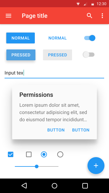
Here is a diagram copied from Wikipedia that shows some typical Material Design UI components2:

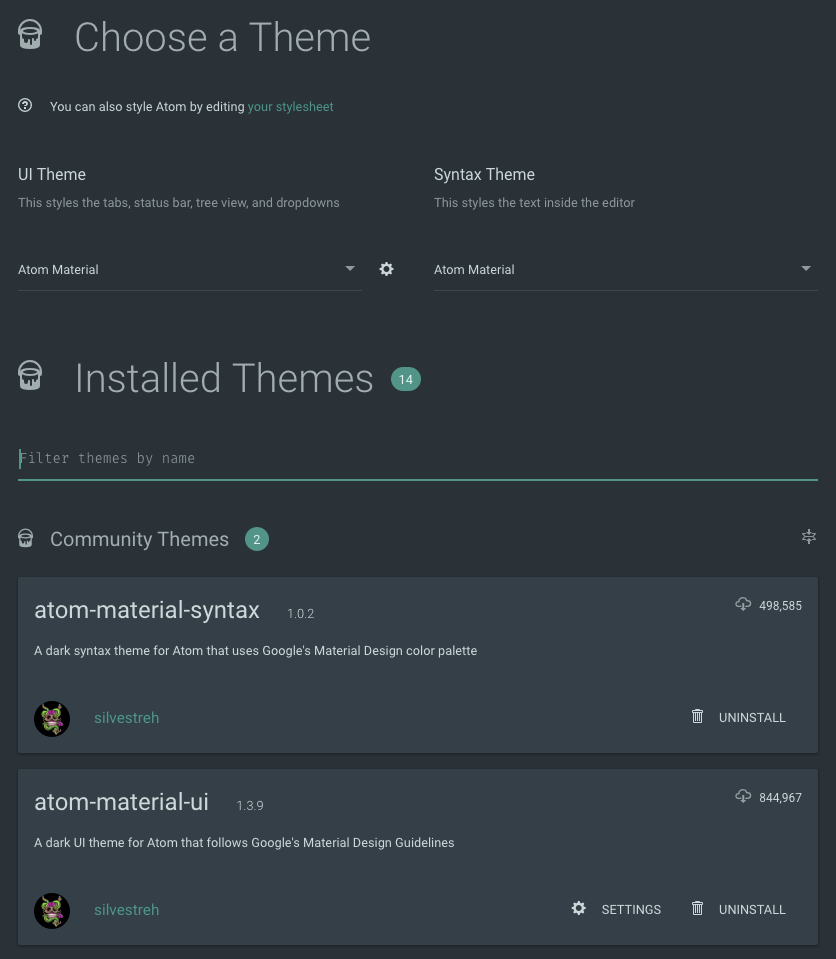
In Atom3, there are relative themes and highlight syntaxs that conforms to the Material Design Guideline. Here is the screenshot about the themes:

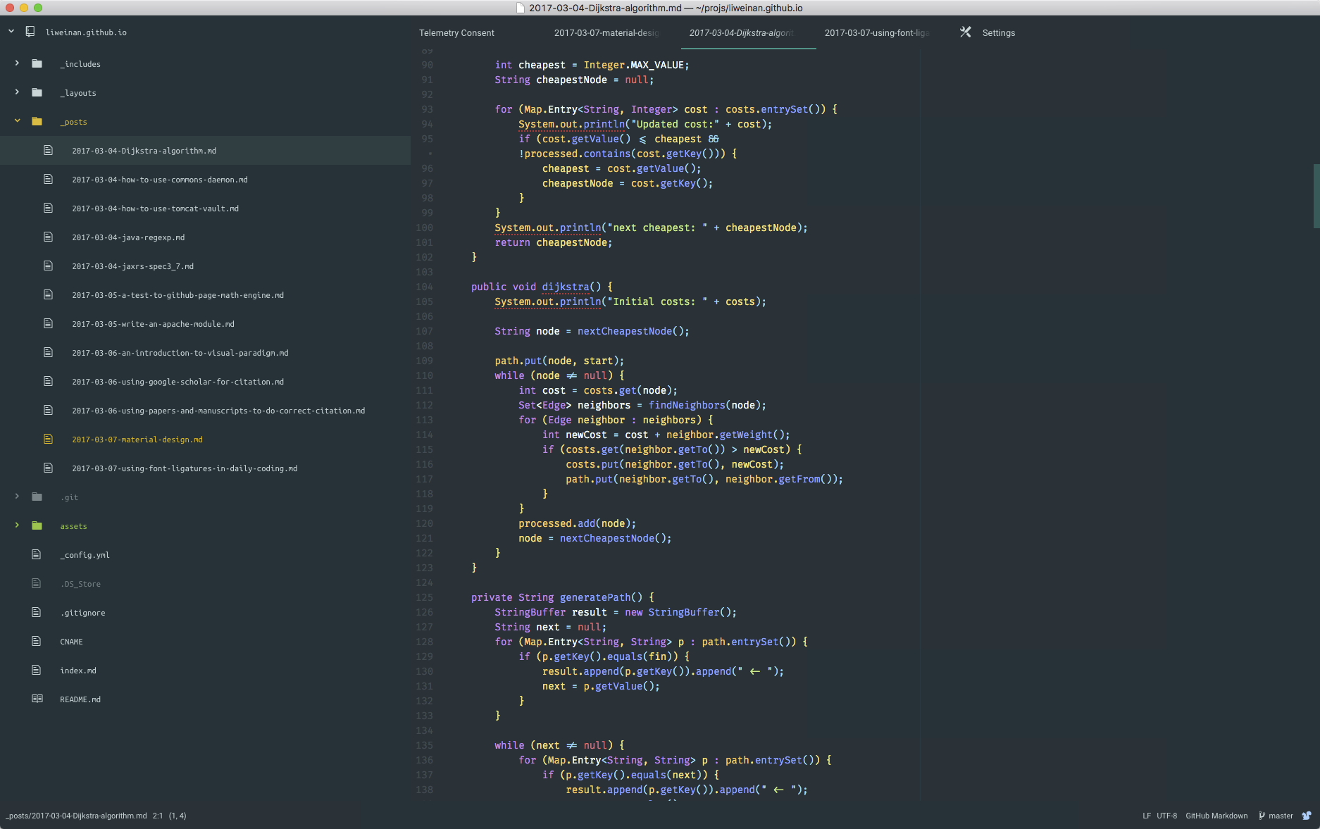
As the screenshot shown above, I have installed atom-material-syntax and atom-material-ui and enabled them in UI Theme and Syntax Theme settings. Here is a screenshot of the Atom appearance after the above two themes are applied:

Please note there are some dynamic behaviors that cannot be shown from above screenshot. In addition, I’d like to recommend you to install a font that supports ligatures. I have also written an article to explain the concept of Typographic Ligature4.
